Example
This is a basic example of a popover.
<script>
	import { Popover, Portal } from '@skeletonlabs/skeleton-svelte';
</script>

<Popover>
	<Popover.Trigger class="btn preset-filled">Trigger</Popover.Trigger>
	<Portal>
		<Popover.Positioner>
			<Popover.Content class="card max-w-md p-4 bg-surface-100-900 shadow-xl space-y-2">
				<Popover.Title class="font-bold">Example</Popover.Title>
				<Popover.Description>This is a basic example of a popover.</Popover.Description>
				<Popover.CloseTrigger class="btn preset-tonal">Close</Popover.CloseTrigger>
			</Popover.Content>
		</Popover.Positioner>
	</Portal>
</Popover>
Title
Lorem ipsum dolor, sit amet consectetur adipisicing elit. Sapiente magni distinctio explicabo quisquam. Rerum impedit culpa nesciunt enim.
import { Popover, Portal } from '@skeletonlabs/skeleton-react';

export default function Default() {
	return (
		<Popover>
			<Popover.Trigger className="btn preset-filled">Trigger</Popover.Trigger>
			<Portal>
				<Popover.Positioner>
					<Popover.Content className="card max-w-md p-4 bg-surface-100-900 shadow-xl space-y-2">
						<Popover.Title className="font-bold">Title</Popover.Title>
						<Popover.Description>
							Lorem ipsum dolor, sit amet consectetur adipisicing elit. Sapiente magni distinctio explicabo quisquam. Rerum impedit culpa
							nesciunt enim.
						</Popover.Description>
						<Popover.CloseTrigger className="btn preset-tonal">Close</Popover.CloseTrigger>
					</Popover.Content>
				</Popover.Positioner>
			</Portal>
		</Popover>
	);
}
Arrow
Use the Arrow to visually connect the popover content to the trigger element. The arrow will automatically align based on the selected side.
This example will have a small arrow.
<script>
	import { Popover, Portal } from '@skeletonlabs/skeleton-svelte';
</script>

<Popover>
	<Popover.Trigger class="btn preset-filled">Trigger</Popover.Trigger>
	<Portal>
		<Popover.Positioner>
			<Popover.Content class="card max-w-md p-4 bg-surface-100-900 shadow-xl space-y-2">
				<Popover.Description>This example will have a small arrow.</Popover.Description>
				<Popover.Arrow style="--arrow-size: calc(var(--spacing) * 2); --arrow-background: var(--color-surface-100-900);">
					<Popover.ArrowTip />
				</Popover.Arrow>
			</Popover.Content>
		</Popover.Positioner>
	</Portal>
</Popover>
Title
Lorem ipsum dolor, sit amet consectetur adipisicing elit. Sapiente magni distinctio explicabo quisquam. Rerum impedit culpa nesciunt enim.
import { Popover, Portal } from '@skeletonlabs/skeleton-react';

export default function Arrow() {
	return (
		<Popover>
			<Popover.Trigger className="btn preset-filled">Trigger</Popover.Trigger>
			<Portal>
				<Popover.Positioner>
					<Popover.Content className="card max-w-md p-4 bg-surface-100-900 shadow-xl space-y-2">
						<Popover.Title className="font-bold">Title</Popover.Title>
						<Popover.Description>
							Lorem ipsum dolor, sit amet consectetur adipisicing elit. Sapiente magni distinctio explicabo quisquam. Rerum impedit culpa
							nesciunt enim.
						</Popover.Description>
						<Popover.CloseTrigger className="btn preset-tonal">Close</Popover.CloseTrigger>
						<Popover.Arrow
							style={{
								['--arrow-size' as string]: 'calc(var(--spacing) * 2)',
								['--arrow-background' as string]: 'var(--color-surface-100-900)',
							}}
						>
							<Popover.ArrowTip />
						</Popover.Arrow>
					</Popover.Content>
				</Popover.Positioner>
			</Portal>
		</Popover>
	);
}
Z-Index
This component is headless by default. If you find the popover content is being clipped, try increasing the z-index on the Positioner part. In some rare cases you may need to use !important to override library defaults.
This example will be below the sibling.
This example will be above the sibling.
Sibling (10)
<script>
	import { Popover, Portal } from '@skeletonlabs/skeleton-svelte';
</script>

<div class="grid grid-cols-2 gap-4">
	<Popover>
		<Popover.Trigger class="btn preset-filled">Default (auto)</Popover.Trigger>
		<Portal>
			<Popover.Positioner>
				<Popover.Content class="card max-w-md p-4 bg-surface-100-900 space-y-2">
					<Popover.Description>This example will be below the sibling.</Popover.Description>
				</Popover.Content>
			</Popover.Positioner>
		</Portal>
	</Popover>

	<Popover>
		<Popover.Trigger class="btn preset-filled">Above (20)</Popover.Trigger>
		<Portal>
			<Popover.Positioner class="z-20!">
				<Popover.Content class="card max-w-md p-4 bg-surface-100-900 shadow-xl space-y-2">
					<Popover.Description>This example will be above the sibling.</Popover.Description>
				</Popover.Content>
			</Popover.Positioner>
		</Portal>
	</Popover>

	<div class="col-span-2 h-[100px] relative">
		<div class="rounded bg-primary-200-800/75 w-full h-full z-10 flex justify-center items-center absolute">Sibling (10)</div>
	</div>
</div>
This example will be below the sibling.
This example will be above the sibling.
Sibling (10)
import { Popover, Portal } from '@skeletonlabs/skeleton-react';

export default function ZIndex() {
	return (
		<div className="grid grid-cols-2 gap-4">
			<Popover>
				<Popover.Trigger className="btn preset-filled">Default (auto)</Popover.Trigger>
				<Portal>
					<Popover.Positioner>
						<Popover.Content className="card max-w-md p-4 bg-surface-100-900 space-y-2">
							<Popover.Description>This example will be below the sibling.</Popover.Description>
						</Popover.Content>
					</Popover.Positioner>
				</Portal>
			</Popover>

			<Popover>
				<Popover.Trigger className="btn preset-filled">Above (20)</Popover.Trigger>
				<Portal>
					<Popover.Positioner className="z-20!">
						<Popover.Content className="card max-w-md p-4 bg-surface-100-900 shadow-xl space-y-2">
							<Popover.Description>This example will be above the sibling.</Popover.Description>
						</Popover.Content>
					</Popover.Positioner>
				</Portal>
			</Popover>

			<div className="col-span-2 h-[100px] relative">
				<div className="rounded bg-primary-200-800/75 w-full h-full z-10 flex justify-center items-center absolute">Sibling (10)</div>
			</div>
		</div>
	);
}
Programmatic Control
You can programmatically open and close the popover using the exposed API from the component. This is useful for custom interactions and keyboard handling strategies.
This popover will appear, stay open for three seconds, then close on it's own.
<script>
	import { Popover, Portal, usePopover } from '@skeletonlabs/skeleton-svelte';

	const id = $props.id();
	const popover = usePopover({
		id: id,
		closeOnInteractOutside: false,
	});

	function showAndHide() {
		popover().setOpen(true);
		setTimeout(() => {
			popover().setOpen(false);
		}, 3000);
	}
</script>

<div class="flex flex-col gap-4">
	<button class="btn preset-filled" onclick={showAndHide}>Show for 3 seconds</button>

	<Popover.Provider value={popover}>
		<Popover.Trigger class="btn preset-tonal">Anchor</Popover.Trigger>
		<Portal>
			<Popover.Positioner>
				<Popover.Content class="card max-w-sm p-4 bg-surface-100-900 shadow-xl space-y-2">
					<Popover.Description>This popover will appear, stay open for three seconds, then close on it's own.</Popover.Description>
				</Popover.Content>
			</Popover.Positioner>
		</Portal>
	</Popover.Provider>
</div>
This popover will appear, stay open for three seconds, then close on it's own.
import { Popover, Portal, usePopover } from '@skeletonlabs/skeleton-react';

export default function Default() {
	const popover = usePopover({
		closeOnInteractOutside: false,
	});

	function showAndHide() {
		popover.setOpen(true);
		setTimeout(() => {
			popover.setOpen(false);
		}, 3000);
	}
	return (
		<div className="flex flex-col gap-4">
			<button className="btn preset-filled" onClick={showAndHide}>
				Show for 3 seconds
			</button>

			<Popover.Provider value={popover}>
				<Popover.Trigger className="btn preset-tonal">Anchor</Popover.Trigger>
				<Portal>
					<Popover.Positioner>
						<Popover.Content className="card max-w-sm p-4 bg-surface-100-900 shadow-xl space-y-2">
							<Popover.Description>This popover will appear, stay open for three seconds, then close on it's own.</Popover.Description>
						</Popover.Content>
					</Popover.Positioner>
				</Portal>
			</Popover.Provider>
		</div>
	);
}
Direction
Example
This is a basic example of a popover.
<script>
	import { Popover, Portal } from '@skeletonlabs/skeleton-svelte';
</script>

<Popover dir="rtl">
	<Popover.Trigger class="btn preset-filled">Trigger</Popover.Trigger>
	<Portal>
		<Popover.Positioner>
			<Popover.Content class="card max-w-md p-4 bg-surface-100-900 shadow-xl space-y-2">
				<Popover.Title class="font-bold">Example</Popover.Title>
				<Popover.Description>This is a basic example of a popover.</Popover.Description>
				<Popover.CloseTrigger class="btn preset-tonal">Close</Popover.CloseTrigger>
			</Popover.Content>
		</Popover.Positioner>
	</Portal>
</Popover>
Title
Lorem ipsum dolor, sit amet consectetur adipisicing elit. Sapiente magni distinctio explicabo quisquam. Rerum impedit culpa nesciunt enim.
import { Popover, Portal } from '@skeletonlabs/skeleton-react';

export default function Dir() {
	return (
		<Popover dir="rtl">
			<Popover.Trigger className="btn preset-filled">Trigger</Popover.Trigger>
			<Portal>
				<Popover.Positioner>
					<Popover.Content className="card max-w-md p-4 bg-surface-100-900 shadow-xl space-y-2">
						<Popover.Title className="font-bold">Title</Popover.Title>
						<Popover.Description>
							Lorem ipsum dolor, sit amet consectetur adipisicing elit. Sapiente magni distinctio explicabo quisquam. Rerum impedit culpa
							nesciunt enim.
						</Popover.Description>
						<Popover.CloseTrigger className="btn preset-tonal">Close</Popover.CloseTrigger>
					</Popover.Content>
				</Popover.Positioner>
			</Portal>
		</Popover>
	);
}
Headless
Hello Skeleton
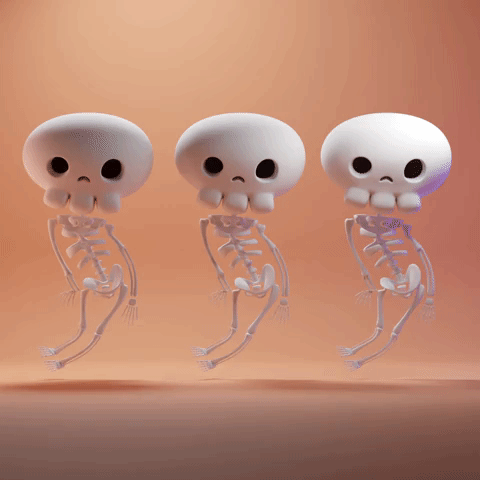
Three spooky skeletons!
<script>
import { SkullIcon } from '@lucide/svelte';
import { Popover, Portal } from '@skeletonlabs/skeleton-svelte';
</script>
<Popover>
<Popover.Trigger>
<SkullIcon class="size-12" />
</Popover.Trigger>
<Portal>
<Popover.Positioner>
<Popover.Content>
<div class="card border border-surface-500/30 bg-surface-200-800/30 backdrop-blur-sm max-w-md p-2 space-y-2 shadow-xl">
<header class="flex justify-between items-center">
<Popover.Title class="font-bold">Hello Skeleton</Popover.Title>
<Popover.CloseTrigger class="btn-icon hover:preset-tonal">×</Popover.CloseTrigger>
</header>
<img
class="size-72"
src="https://media3.giphy.com/media/v1.Y2lkPTc5MGI3NjExNWVmbzcxanp6YmtxZ28xcXBqaXBscThsdDZ5Nm9ncWxkeWtqaHJ2bSZlcD12MV9pbnRlcm5hbF9naWZfYnlfaWQmY3Q9dg/dn1PN6NtunfnUjUGFC/giphy.gif"
alt="Skeleton Gif"
/>
<Popover.Description class="text-xs text-center">Three spooky skeletons!</Popover.Description>
</div>
</Popover.Content>
</Popover.Positioner>
</Portal>
</Popover>
Title
Lorem ipsum dolor, sit amet consectetur adipisicing elit. Sapiente magni distinctio explicabo quisquam. Rerum impedit culpa nesciunt enim.
import { Popover, Portal } from '@skeletonlabs/skeleton-react';

export default function Headless() {
	return (
		<Popover>
			<Popover.Trigger className="btn preset-filled">Trigger</Popover.Trigger>
			<Portal>
				<Popover.Positioner>
					<Popover.Content className="card max-w-md p-4 bg-surface-100-900 shadow-xl space-y-2">
						<Popover.Title className="font-bold">Title</Popover.Title>
						<Popover.Description>
							Lorem ipsum dolor, sit amet consectetur adipisicing elit. Sapiente magni distinctio explicabo quisquam. Rerum impedit culpa
							nesciunt enim.
						</Popover.Description>
						<Popover.CloseTrigger className="btn preset-tonal">Close</Popover.CloseTrigger>
					</Popover.Content>
				</Popover.Positioner>
			</Portal>
		</Popover>
	);
}
API Reference
Root
| Property | Default | Type |
|---|---|---|
children | - | ReactNode |
autoFocus | true | boolean | undefinedWhether to automatically set focus on the first focusable content within the popover when opened. |
dir | "ltr" | "ltr" | "rtl" | undefinedThe document's text/writing direction. |
ids | - | Partial<{ anchor: string; trigger: string; content: string; title: string; description: string; closeTrigger: string; positioner: string; arrow: string; }> | undefined The ids of the elements in the popover. Useful for composition. |
modal | false | boolean | undefinedWhether the popover should be modal. When set to `true`: - interaction with outside elements will be disabled - only popover content will be visible to screen readers - scrolling is blocked - focus is trapped within the popover |
portalled | true | boolean | undefinedWhether the popover is portalled. This will proxy the tabbing behavior regardless of the DOM position of the popover content. |
initialFocusEl | - | (() => HTMLElement | null) | undefinedThe element to focus on when the popover is opened. |
closeOnInteractOutside | true | boolean | undefinedWhether to close the popover when the user clicks outside of the popover. |
closeOnEscape | true | boolean | undefinedWhether to close the popover when the escape key is pressed. |
onOpenChange | - | ((details: OpenChangeDetails) => void) | undefinedFunction invoked when the popover opens or closes |
positioning | - | PositioningOptions | undefinedThe user provided options used to position the popover content |
open | - | boolean | undefinedThe controlled open state of the popover |
defaultOpen | - | boolean | undefinedThe initial open state of the popover when rendered. Use when you don't need to control the open state of the popover. |
getRootNode | - | (() => Node | ShadowRoot | Document) | undefinedA root node to correctly resolve document in custom environments. E.x.: Iframes, Electron. |
onEscapeKeyDown | - | ((event: KeyboardEvent) => void) | undefinedFunction called when the escape key is pressed |
onRequestDismiss | - | ((event: LayerDismissEvent) => void) | undefinedFunction called when this layer is closed due to a parent layer being closed |
onPointerDownOutside | - | ((event: PointerDownOutsideEvent) => void) | undefinedFunction called when the pointer is pressed down outside the component |
onFocusOutside | - | ((event: FocusOutsideEvent) => void) | undefinedFunction called when the focus is moved outside the component |
onInteractOutside | - | ((event: InteractOutsideEvent) => void) | undefinedFunction called when an interaction happens outside the component |
persistentElements | - | (() => Element | null)[] | undefinedReturns the persistent elements that: - should not have pointer-events disabled - should not trigger the dismiss event |
RootProvider
| Property | Default | Type |
|---|---|---|
value | - | PopoverApi<PropTypes> |
children | - | ReactNode |
RootContext
| Property | Default | Type |
|---|---|---|
children | - | (popover: PopoverApi<PropTypes>) => ReactNode |
Trigger
| Property | Default | Type |
|---|---|---|
children | - | ReactNode |
element | - | ((attributes: HTMLAttributes<"button">) => Element) | undefinedRender the element yourself |
Positioner
| Property | Default | Type |
|---|---|---|
element | - | ((attributes: HTMLAttributes<"div">) => Element) | undefinedRender the element yourself |
Content
| Property | Default | Type |
|---|---|---|
element | - | ((attributes: HTMLAttributes<"div">) => Element) | undefinedRender the element yourself |
Arrow
| Property | Default | Type |
|---|---|---|
element | - | ((attributes: HTMLAttributes<"div">) => Element) | undefinedRender the element yourself |
ArrowTip
| Property | Default | Type |
|---|---|---|
element | - | ((attributes: HTMLAttributes<"div">) => Element) | undefinedRender the element yourself |
Title
| Property | Default | Type |
|---|---|---|
element | - | ((attributes: HTMLAttributes<"div">) => Element) | undefinedRender the element yourself |
Description
| Property | Default | Type |
|---|---|---|
element | - | ((attributes: HTMLAttributes<"div">) => Element) | undefinedRender the element yourself |
CloseTrigger
| Property | Default | Type |
|---|---|---|
element | - | ((attributes: HTMLAttributes<"button">) => Element) | undefinedRender the element yourself |